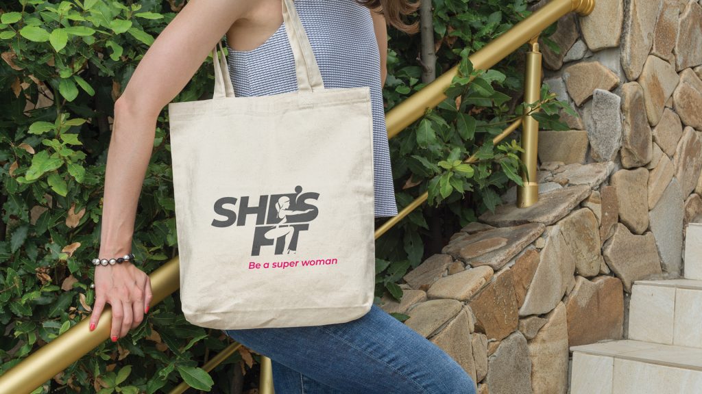
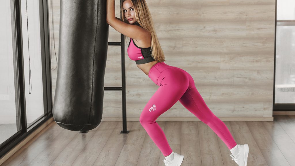
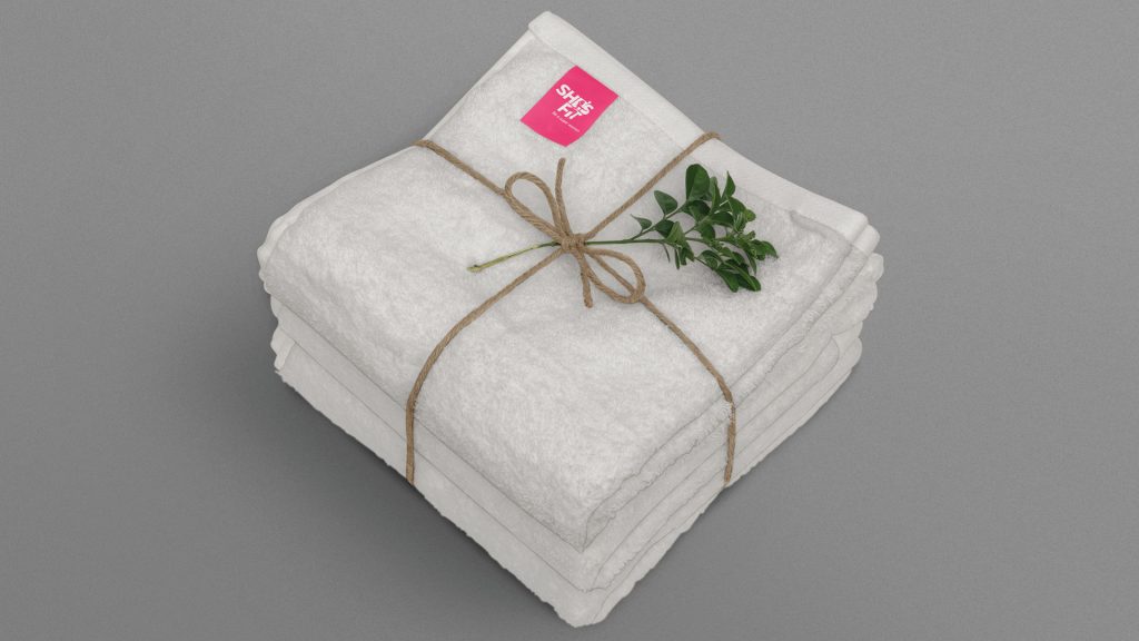
Be a super woman
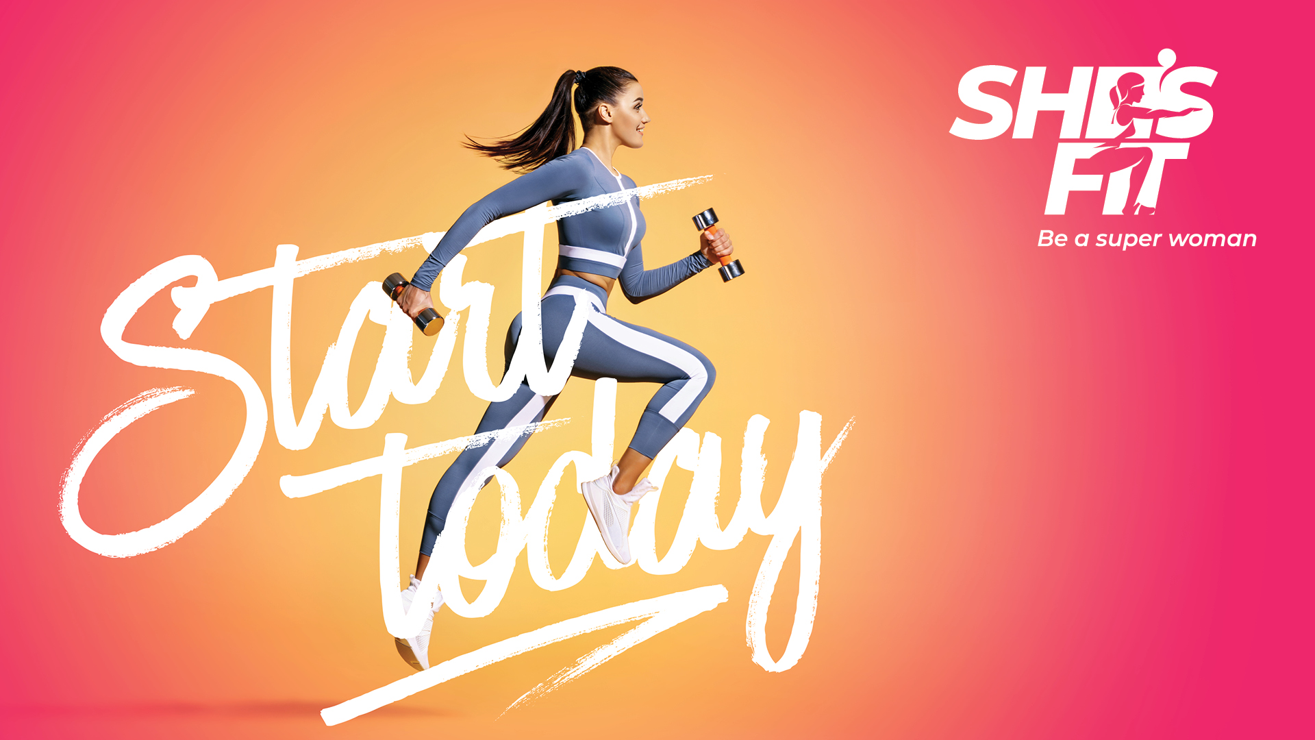
A fitness and training center exclusively for women, based in Jordan required a branding design that clearly communicates the uniqueness and exclusiveness of the company.
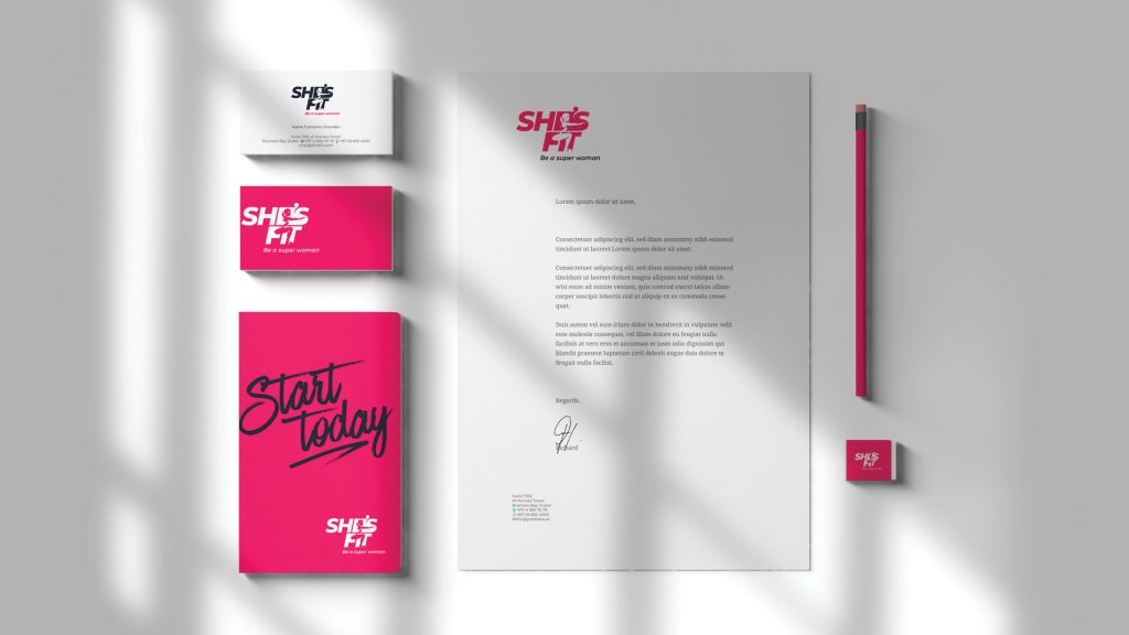
The brand name, “She’s fit” evinced a feeling that women, in general are physically fit. The brand strategies were based on this wide idea. The logo was designed with bold letters implying that the brand is making a statement. Bold pink and white were used as brand colours. A physically fit women’s image was superimposed to shout out the principles of the brand.

We’re always open to share ideas, get in touch with us. Let’s build it together.

